

In this part of our ongoing series about Building reusable custom components with Vue.js we are going to build an autocomplete dropdown from scratch.
It’s reasonable to ask why we don’t just use one of the many existing auto complete components available for Vue.js.
For us it came down to:
- Not finding an existing component that behaved exactly how we wanted
- Trying to keep our dependency footprint small
- Wanting to focus on simple UI interaction first and circle back around to enhanced functionality later
Keep in mind, however, the lesson here is not that you should build all of your autocompletes from scratch. Rather, I want to show you how to build any kind of component in a way that allows you to enhance its functionality over time and ensures that you can reuse your components across your application.
Getting Started
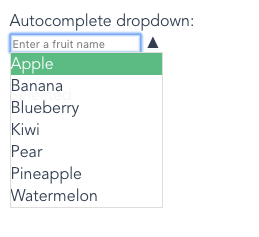
Here’s what we are going to be creating:
We’ll start by copying the contents of Dropdown.vue into a new component AutocompleteDropdown.vue. Then we can load it in our Filters.vue component:
Autocomplete field
Text field
Our first step is to remove the HTML select element. Our final component will not use a standard dropdown. Instead we will allow the user to type their choice into a text box. As they type, results which match the available options will be displayed in a list below the text box.
We don’t want to directly set the selected option to whatever is typed into the text field. Rather we want to use what is typed as a query to search against the available options. So, we will v-model the input’s value to a new data property in our component called searchText:
We can also remove our mounted handler and watch handlers as we will be reimplementing that behavior.
Matches
Next, we need a way for the component to determine which, if any, of the available options match the supplied search text.
We can do this with a computed property that filters an array of options based on some criteria.
Let’s break this down piece by piece.
Recall from Part 2 that our options are specified as an object with string keys. This means that we can’t call filter on it directly. Instead we convert the key => value properties into an array of [key, value] arrays using Object.entries.
Note: not all browsers support Object.entries. If you need to, you can use a shim or just create the array yourself:
Next, we filter the array of options with a custom function. That function takes the first element of the option array, which is the text of the option, and converts it to uppercase. We then perform a direct match against the uppercase searchText which is provided by our text input.
Note: you can make the autocomplete case-sensitive by removing both of the calls to toUppercase().
At this point we can test our matching behavior by adding a template tag for matches:
Try typing into the text field, you should see the set of computed matches change as you type.
Dropdown
Next we need to implement the completion suggestion dropdown.
We will render this in the template as a ul with one or more list items representing the matched items:
and add some accompanying styles which position our list below the input:
Note: you can remove the ‘matches’ tag we added in the last step now.
Open/close behavior
CSS class
We will now introduce the concept of our suggestion dropdown being “open” or “closed”. We’ll track this with a data property and a class on the dropdown’s parent component:
And some basic styles:
Toggle button
Next, we add a button the user can click to manually toggle the suggestion list open and closed:
Place that right below the input.
Then we add a setOpen handler for our toggle button:
Note: we could have achieved the same behavior without creating a method. We could have done this:
Note how we can toggle the
openvalue directly, rather than calling method to do it.The reason that we don’t do that is because later on we will add some additional behavior for when the list opens and closes and we want to make sure that is all handled in one place.
Finally, we want to automatically open the suggestion list when the user types in the search box. We do this by binding a method to the text field’s input event:
It’s starting to look like a real autocomplete!
Mouse selection
Our first step for handling selection is to allow the user to click on one of the options in the suggestion list. When this happens we need to:
- Close the suggestion list
- Set the text in the search box to match the selected value’s text label
- Emit an
inputevent from our component with the selected value
To do this, we will create a general method to handle selecting an option:
Recall that a suggestion comes from the matches computed value and it is an array where the first element is the human-readable text of the option and the second element is the option value itself.
Next, we set suggestionSelected() as the click handler for the suggestion items:
To round things out we’ll add a few styles to make the items look clickable:
Complete v-model support
At this point we only have half of our v-model support. The component emits an input event when a value is selected but nothing happens if the value prop changes. Let’s fix that.
We need to handle updating our component’s state when a new value is provided. For the autocomplete this means setting the search field text to be the label text for the provided value. We’ll add a method to do this for us:
The method iterates over all of the keys in the options object and sets searchText when it finds the key that corresponds to the new value.
(If you are using Lodash you can use the findKey method to do the same thing.)
We need to call this when our component is mounted:
and any time the value prop changes:
With this in place, the component will now update when the other dropdowns are changed.
Keyboard selection
Another important part of our component is having the ability to navigate and select suggestions using the keyboard.
To do this we will:
- Add a property to track the index of the currently highlighted suggestion
- Update the suggestion list to indicate the currently highlighted suggestion
- Bind events to the up and down arrow keys to move the highlight up and down
- Bind an event to the enter key to select the currently highlighted suggestion
We’ll start by adding a highlightIndex data property:
Then, we add an active class to the currently highlighted item:
and finally some CSS:
Next we bind handlers for the arrow keys. We add these to the input:
For our handlers we want a specific behavior. If the suggestion list is open then the arrow keys should move the highlight up and down. If the suggestion list is not open, then pressing an arrow key should open the list. This matches the behavior when navigating a standard dropdown with the arrow keys:
We should also reset the highlightedIndex back to zero anytime the user changes the search filter:
To round put the functionality we just need to add a handler for the enter key:
This handler uses the existing suggestionSelected method we created earlier.
Additional UX cleanup
Our component is almost done. There are just a few small tweaks we can make which will really improve the user experience.
Input focusing
First, it is helpful to focus the search text field immediately after opening the suggestion list. Once the user opens the list they either want to type a query to refine the list or navigate the suggestions with the keyboard. Focusing the search field right away saves the user an additional click.
In order to focus our field we need a reference to the actual HTML element within our code. We can do this by providing a ref attribute for the element:
Then, in the setOpen method:
Suggestion dismissal
We want to allow the user to dismiss the suggestion list by pressing the escape key or by clicking away from the search field. Two simple event handlers will do this for us:
Customizable placeholder
It’s helpful to show an instructive placeholder in the search field. However, the actual text of this should be customizable by the parent component. A simple prop will handle this nicely:
Then, in our parent component (Filters.vue):
Advanced toggle behavior
There is a subtle change to the dropdown we can make at this point which will go a long way towards making it feel really responsive.
If you are following along with the example code, try this:
- Select a fruit using the “Basic dropdown”
- Click the arrow to open the suggestion list
Notice how the only suggestions shown are ones that match the text of the selected option. This makes sense on a technical level but it’s not optimal from a user experience perspective.
The idea is that this autocomplete dropdown should behave very much like a standard dropdown with the additional ability to filter the list of options by typing in text. The problem we have is that in certain cases, such as when an option is already selected, the dropdown doesn’t let the user see all of the choices. The user has to manually select and delete the search text before the full suggestion list shows up. This can be unexpected and when encountered repeatedly it makes the component feel slow and broken.
A simple fix for this is to clear out the search field when opening the suggestion list:
Now, you can see all of the results when you click toggle dropdown open and you can immediately start typing to filter the list. However, this feels broken in the case where:
- Some value is set
- The user clicks to open the suggestion list
- The user immediately closes the suggestion list
In this case the user hasn’t selected anything or typed in a search query. Closing the suggestion list feels like it should be a “Cancel” action but it has the result of leaving the search field empty.
What we need to do is keep track of searchText when we open the suggestion list. Then, if the user closes the list without making a choice or typing in query, we should restore the previous searchText.
We’ll start by adding a data property for our lastSearchText:
Then we update setOpen to store and retrieve the lastSearchText when appropriate:
Advanced matching
Currently our search matching behavior is very basic. Options are matched if they contain the exact search text (case-insensitive).
For our project dropdown we wanted to support a more advanced partial matching system similar to how Sublime Text’s Goto Anything panel works.
That is, if you have the following options:
- Project One
- Project Two
- Company One
- Company Two
Typing “proj” will return:
- Project One
- Project Two
and typing “proj on” will return:
- Project One
We can achieve this behavior by changing our match regex from this:
to this:
Summary
Now, take a look at the behavior we have in place. We’ve created a fully customizable autocomplete drop-down. It is reusable for any set of option values. It supports binding it’s value using v-model and has good support for keyboard navigation.
Now look at the code in the parent component. The only difference between the basic drop-down and the autocomplete drop-down is a single placeholder attribute. In every other respect they are interchangeable.
This is very powerful and is the key takeaway I hope you get out of this series.
Comments
Really great post, I’m trying
Really great post, I’m trying to understand how to build reusable components fully and wanted to know if you heather full code was available for this?
Brilliant series which brings
Brilliant series which brings together so many Vue concepts for newcomers, all together in one place.
Just to complete the picture, would be great to see where options (fruit) have other attributes e.g. string: colour; or array: countries of origin, how to display those particular attributes for a selected fruit in text boxes or lists near the dropdowns.
For the advanced class, choosing the selection criteria from the available attributes - (fruit) name, colour or country of origin - still re-using the same components for the basic or auto -complete options.
Thanks again, Jay
Christchurch, Dorset UK
Add new comment